
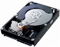
 I came home the other night and found out that I had a dead hard drive on my main file server. D’oh! That machine carries every one of our photos since we got a digital camera and a ton of the print photos from early in our childhood. It’s irreplaceable!
But, of course, I have multiple levels of backup so I knew my data was safe. It’s just a matter of getting it back to a healthy condition.
I decided to just let the drive sit there and wait for a replacement to arrive from Amazon. (4TB for $142!) Each file is stored on two physical drives so once I put the new drive in, it would automatically copy the files back onto the drive and I’d be all set.
Well, while I was waiting, the machine reported that a second drive had failed. It was the other one that I had purchased as the same time as the first drive so it’s not completely unreasonable that they failed together, but it still seemed unlikely. Looking through the SMART data on the drive, it looks like it got pretty hot in the case at one point so maybe that led to early demise (3 months after the 2 year warranty expired.) Now I had a mess on my hands and would be forced to pull out some backups.
I didn’t want to wait around so I drove to Best Buy and paid $40 extra for the same drive. Thankfully I was able to get the second failed drive to boot up again so the server was able to heal itself. When the new drive arrived from Amazon, I replaced that second drive because I just don’t trust it anymore. The machine now has four 4TB drives in it and all our files are safe.
I don’t know how you could read this site and not have heard me say it before, but BACK UP YOUR DATA! Hard drives only carry a one or two year warranty for a reason. Here’s the test for whether you are doing enough backups: if I walk into your house, take your computer and smash it with a sledgehammer, did you just lose photos, videos, documents, etc? If so, you’re not doing your backups correctly. Here’s the very quick and very economical solution: http://crashplan.com Less than $200 will get you four years of worry free backups. Set it up once and forget about it until you need it.
 If your computer is acting weird, slow or you suspect a virus, Windows 8 has two great new features that will help you get back to normal again.
 So you need to share a big file or a bunch of files that add up to a lot. This problem has been around since time began and it’s often still easier to hand someone a physical piece of media like an SD card or a CD. But there are (free) ways to do it online and they aren’t terribly difficult. I can think of a dozen different ways to do it off the top of my head, but I’m going to pick one and yes, it’s a Microsoft solution. What did you expect?
 You may remember a previous post about a product called
  I’ve written a couple times before about my Power BI project at work. The head of our group gave a presentation at the Worldwide Partner Conference that provides a nice overview of our future roadmap. To view it, go the
  Last November, I posted that I was


 I’ve been posting lots of quick, little examples showing off pieces of our Power BI offering, but now I’ve got a huge one for you. Our team recently acquired access to a HUGE data set of statistics. With the World Cup starting up, we decided to use World Cup statistics for a great demo.
 The general media has picked up on a huge bug that rocked the tech world this week. I’m sure it’s partially because it has such a great name and logo. But what is Heartbleed and how does it affect you?
 I know I’ve been making a lot of Power Query posts lately, but once you get into it, you start seeing data everywhere! The latest example is a movie draft that I participate in with some friends. I won’t explain what a movie draft is except to say that it’s like fantasy football for movies. We participate in a huge league run by Brian Brushwood and friends. They post a spreadsheet with all the data here: