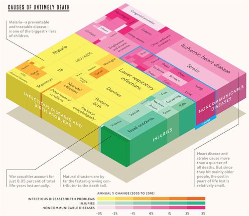
Bill Gates posted a great graphic on his Facebook page recently showing what causes deaths around the world. If you watch the nightly news, you might think that wars are a majority of the chart, but nope, that’s only 0.05% of all deaths. The biggest killers are heart disease and stroke. They combine for over 25% of all deaths. I’ve spent a lot of time just staring at the chart and being surprised by it. For example, did you know that diarrhea kills more people than car accidents? Or did you know that brain, pancreactic, cervical, breast, and throat cancers each kill about the same number of people as whooping cough?
Bill’s foundation is focused on eradicating huge chunks of this chart, specifically malaria. It’s is one of the biggest killers of children and it’s completely preventable. I’m really interested to see this same chart in 20 years.

