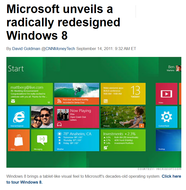
[UPDATE 5/4/2022] It’s worth noting that this post was written in May of 2021. The scoring model has changed significantly, but the basic premise applies of doing some analysis of the different ways that you can score points and figuring out the best return for your time.
For the last seven months, I’ve been taking Spanish lessons every single day via the DuoLingo app. I feel like I’d struggle to communicate at a 2-year-old level, but progress is progress and it’s a better way to spend time on my phone than playing games or reading the news. This isn’t an ad, but if you are interested in trying it out, the app is free or you can pay to get rid of ads and support their cause.
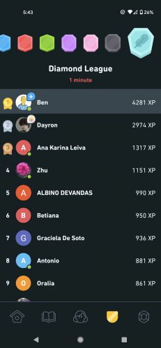
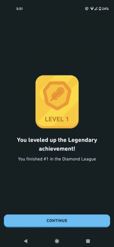
The app is, obviously, centered around progressing through lessons, but along the way, you collect points and achievements. There’s one achievement for getting first place in the diamond league which is the highest league in the app. Other than getting the achievement, there’s literally no value in doing this. But I have a completionist itch that needed to be scratched so here’s how I did it…
I hung around in the league for weeks until I finally saw a week where it didn’t look like anyone was running away with the game. Then I pounced and did about 600 points in one day. A normal day for me is 100 which is enough to stay comfortably in the diamond league so it’s more than most people do but far from enough to win the league. Two other people had the same idea so I continued to put in 800-1000 points per day until finally they both gave up and my final day was pretty slow. The league finishes around UTC midnight on Sunday and I won with about 4200 points.
Here’s what I learned along the way:
- I think I probably could have done it with fewer points if I had gone hard straight from the beginning. Go in with guns blazing looking like you have a few screws loose and people are less likely to want to play with you.
- I timed myself on various parts of the app to figure out where I could make the most points per minute.
- In general, the stories are great ways to make points quickly. The highest value story I had unlocked was 28 points, and while the first run through took a while, after that I could do it while watching TV and not really paying attention. I could generate 17 points per minute with this approach.
- Using the app, you can choose between regular practice and hard practice. Every day I would do the hard practice on all the easy lessons. That’s 20 points plus 5 for a perfect run through the lesson.
- Missed words go into a separate challenge bucket and are worth two points per word. I would purposely miss all 20 questions on the easy lesson, get the 25 points for doing the lesson correctly and then get an extra 40 points for doing the words in the missed queue. None of that is more productive than doing the 28 point story over and over again but it was close and it was less mind-numbing. I could generate 15 points per minute with this approach.
- The DuoLingo Fandom wiki explains the leagues in details, but basically each room of the league is filled up with 30 participants based on when they record their first points after the start of the week. You could try to game that a little by waiting a while until less avid users are logging points, but I didn’t. In some games, leagues like this look different for everyone so you’re not actually competing head to head. That doesn’t seem to be the case with DuoLingo. Everyone else in the league sees the same participant list that you do.
The week finally ended and I won. I learned almost nothing about Spanish during the week and the whole thing was ridiculous, except now my achievements list is closer to being all gold. And that’s probably only marginally better than ridiculous.
It was an interesting experience and now I can stop thinking about when I might try it, but I’m glad it’s over so I can get back to actually attempting to learn Spanish. All week long, I kept hearing Drew Carey saying: “Welcome to ‘Whose Line Is It Anyway?’ the show where everything’s made up and the points don’t matter.”


Online Church Services
For the last 65 weeks, I’ve been working with Pastor and our organists to put together online services for YouTube and Facebook. This past week, I finished up editing my final one, at least for now. Our pastor has taken a call to Colorado and while we call for a new pastor, we’ll have a vacancy pastor from Beautiful Savior in Everett. They already have an online worship option via Zoom so that means no more video editing for me! (Members, watch your email and our Facebook page for more info.)
There are so many things that went right with these online services.
The final tally was ~150 videos! In addition to the main service videos, I also posted the children’s sermon and sermon separately. All three videos got uploaded to both Facebook and YouTube so I guess that’s more like 300 videos. In addition to the Sunday content, We had some midweek services and special videos as well like the group hymn. If you’re looking back through the list, I’ve unlisted some of the full services on our YouTube channel because I’m tired of fighting bad copyright claims on public domain music, but all of the sermons are still there and I’ll leave a few of the services as well.
I’m looking forward to having a bit of extra time in my schedule and being a participant in the online services, but I’m thankful for all of the skills I picked up along the way. Learning new things is fun but learning new things to enable others to worship during lockdown was even better!